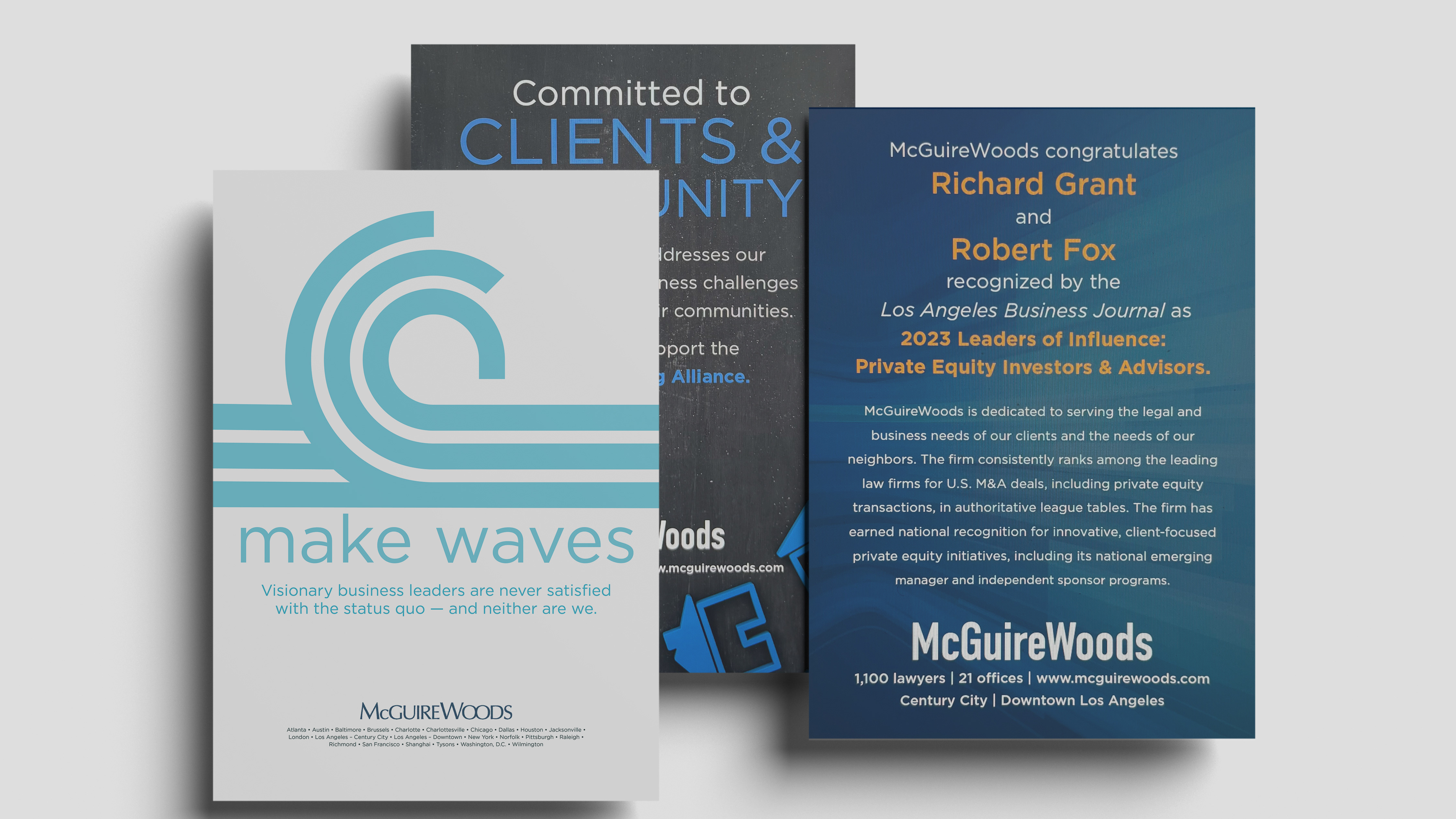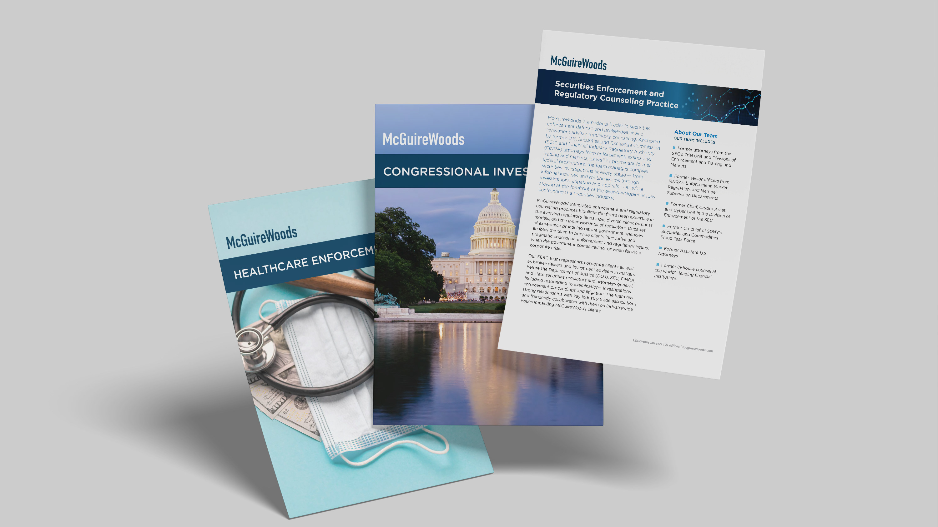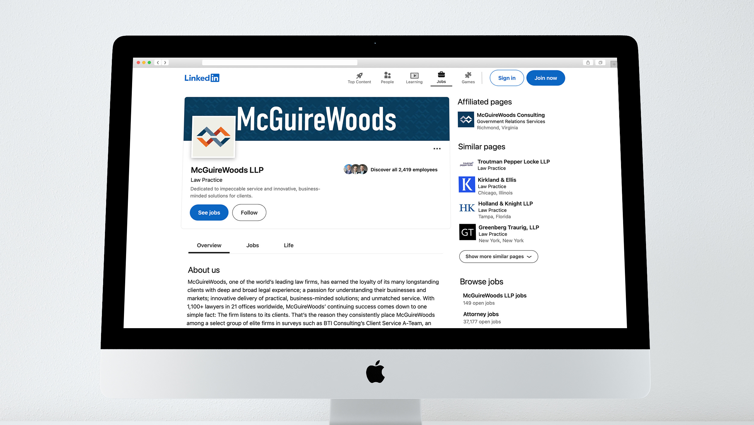
In 2019, our design team set out to create a new logo using only internal resources. A challenge that required both creative exploration and a deep understanding of the firm’s evolving identity.
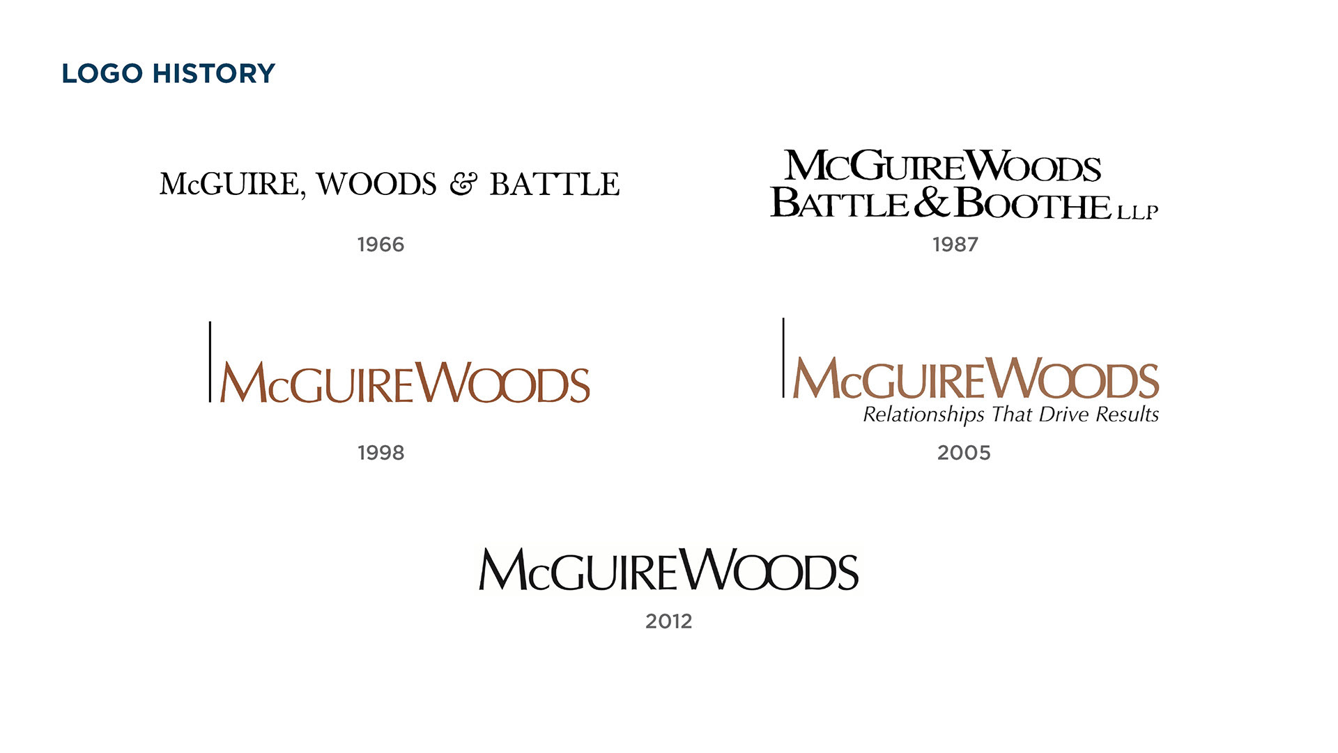
To ground our approach, we started by studying the existing logo and how the brand had developed over time.
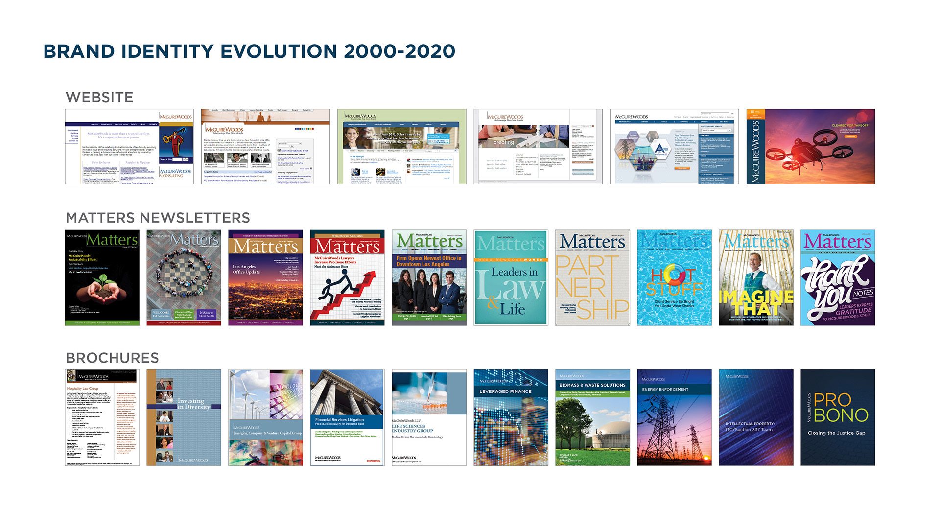
We reviewed nearly two decades of websites, newsletters, and marketing materials. One of the clearest insights from this process was how much the broader brand had evolved.
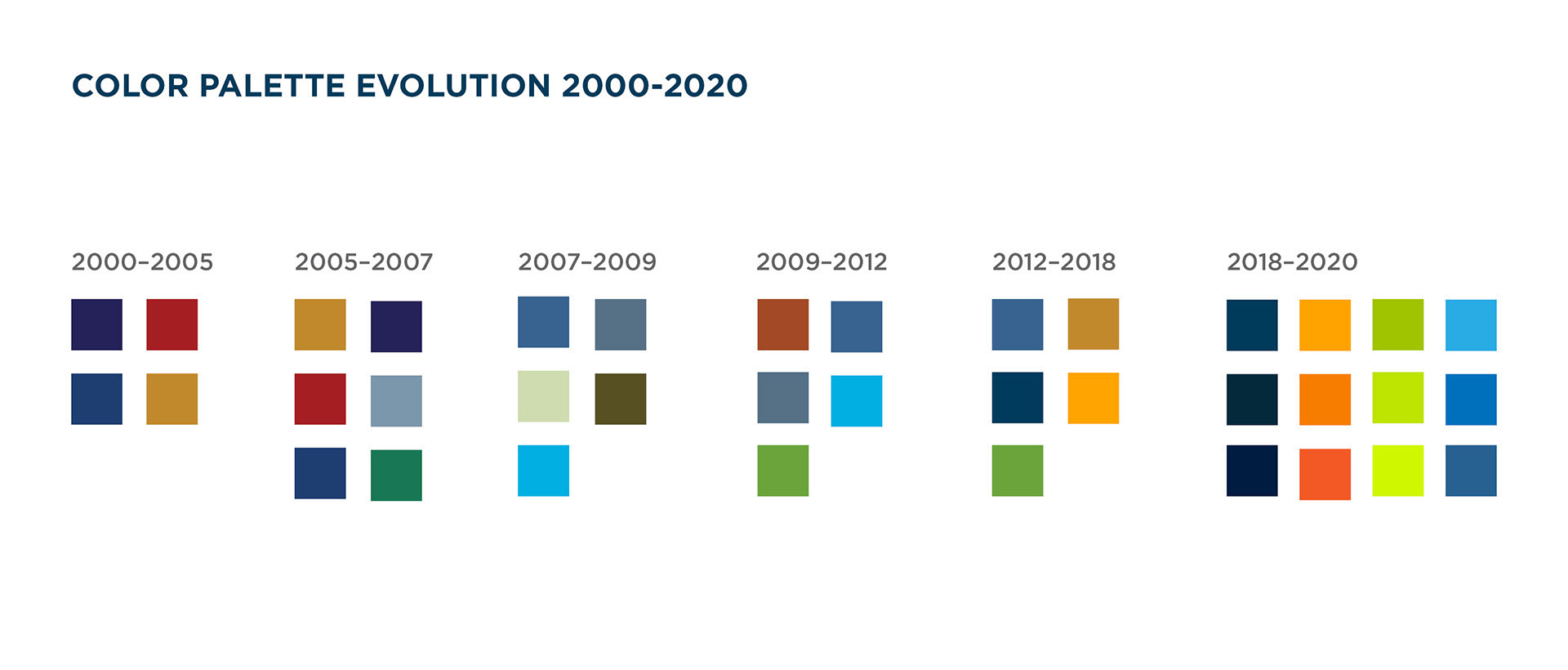
Our color palette had become brighter, higher in contrast, and more dynamic—while the logo itself
remained relatively static.
remained relatively static.
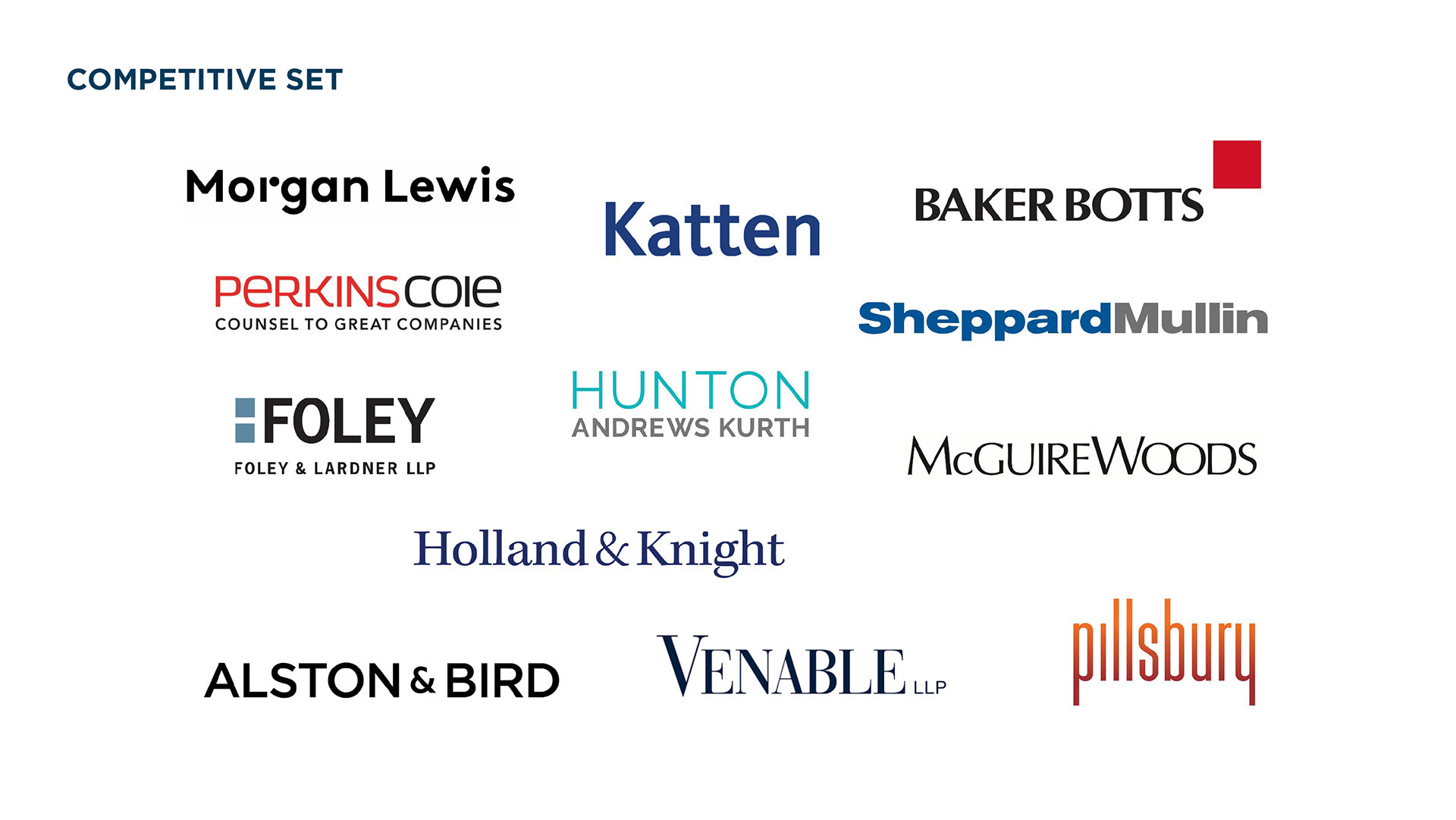
Compared to key competitors, our logo looked outdated. It faded into the background instead of standing out.
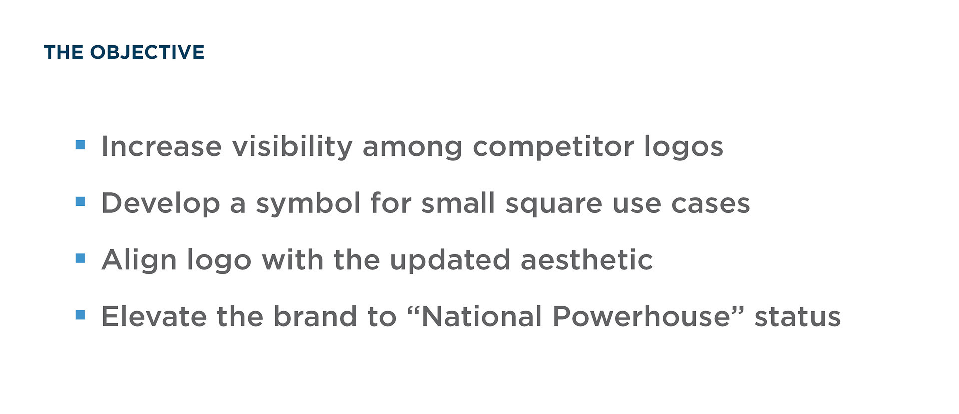
This disconnect became the core problem we set out to solve: aligning the logo with a brand that had already matured into a more modern, confident, and nationally recognized presence.
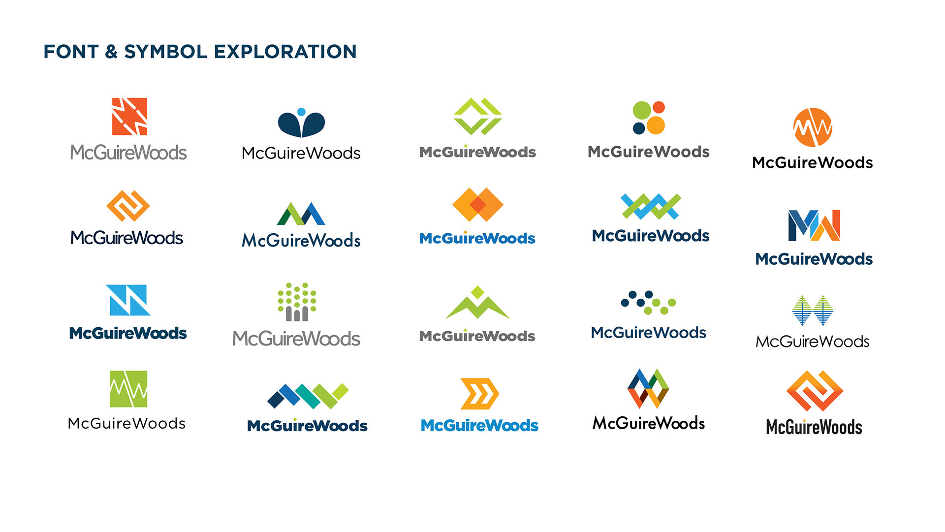
I worked with two other designers to explore new typography, symbols, and layouts. We tested broad ideas, picked the best ones, and refined them further.
During this phase, I proposed using the typeface DIN Condensed for the logo. I chose it because the firm wanted to be seen as a national powerhouse. Condensed type looks tall, efficient, and strong. It makes the firm's name stand out on everything from mobile screens to large building signs.
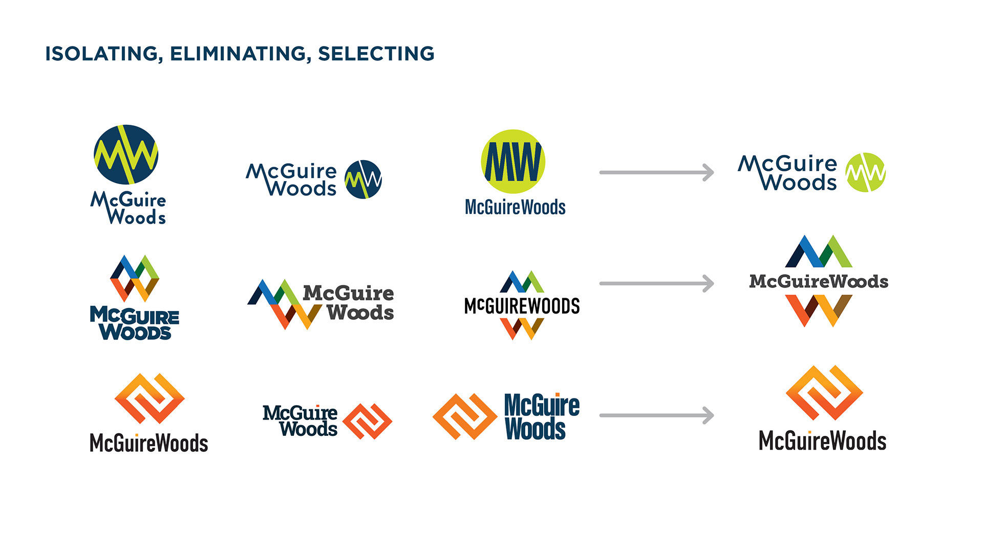
As the concepts evolved, we narrowed the work down to three distinct directions.
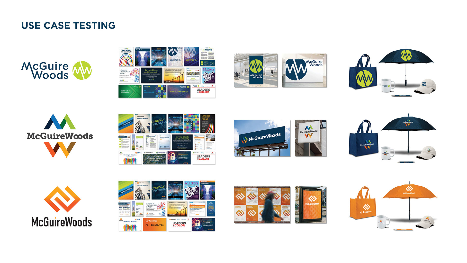
From there, we built mockups to show how each option looked in the real world—on presentations, signs, and digital platforms. This helped leaders judge the designs based on how they actually worked, rather than just personal taste.
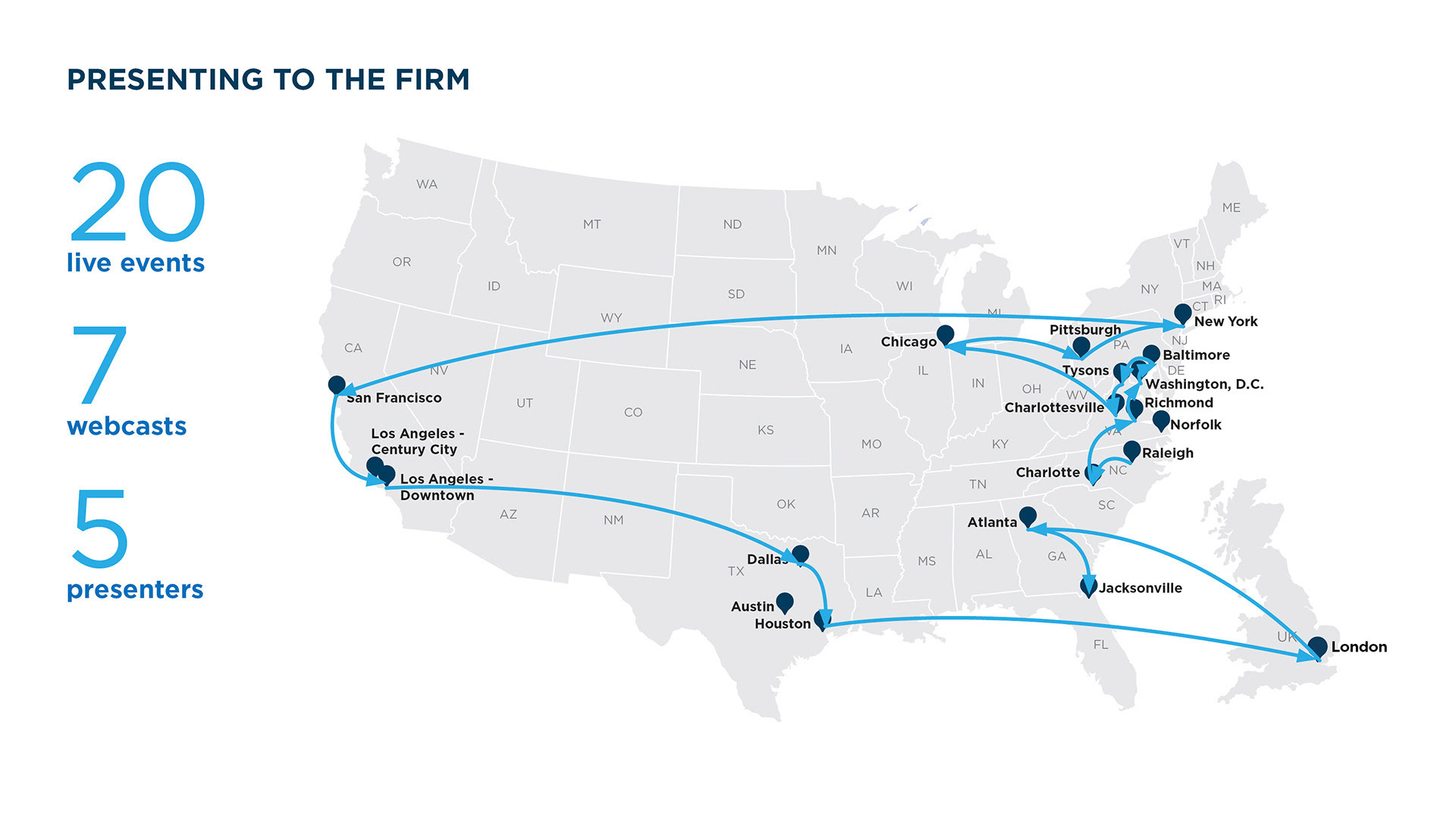
We also gathered feedback from the whole firm. We hosted live and streamed presentations so employees could see the concepts and share their thoughts.
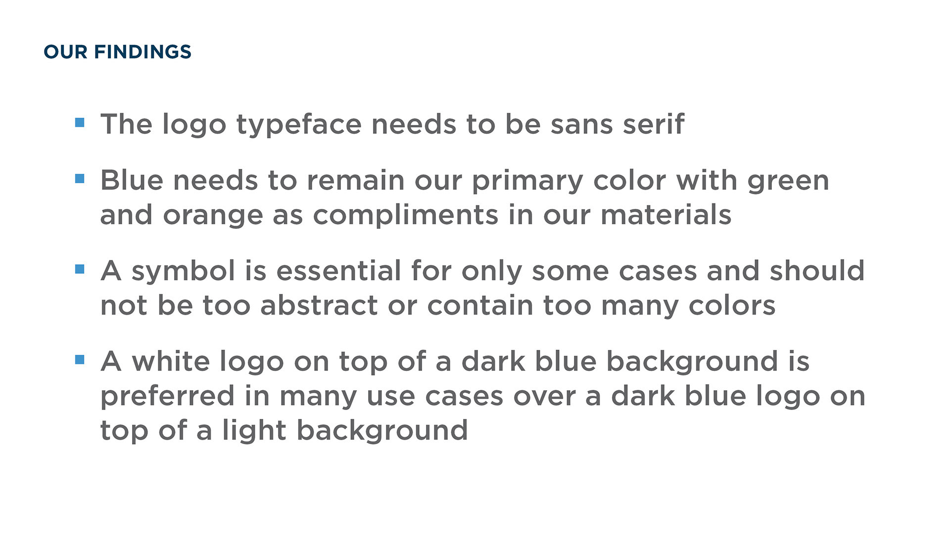
Their input was invaluable. While opinions varied, consistent themes emerged around what felt authentic, recognizable, and representative of the firm’s identity.
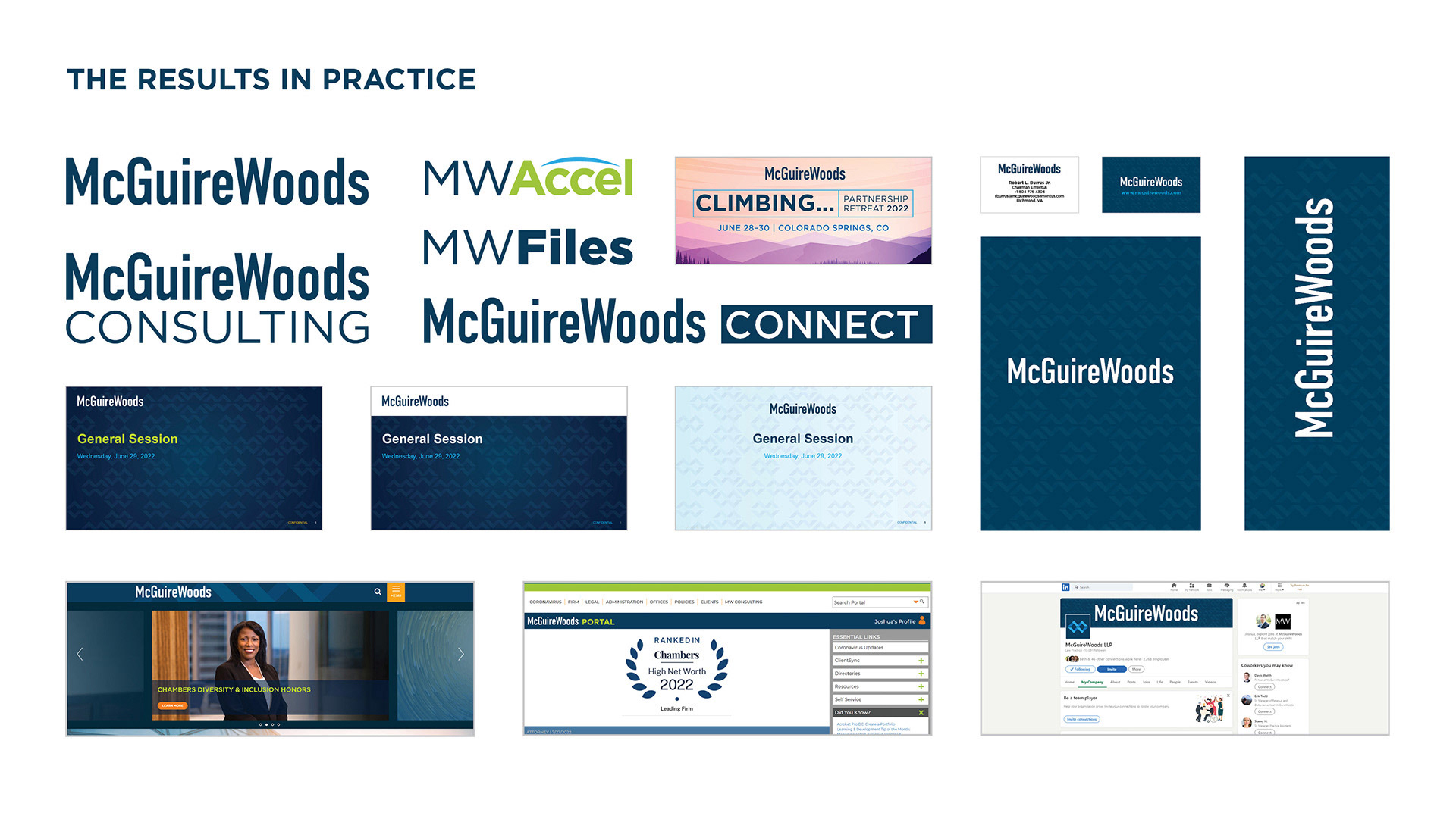
The final design paired a refined DIN Condensed wordmark with the firm’s classic navy blue. We added a flexible symbol that worked well on social media and in physical spaces. This system balanced tradition with modernity—preserving the firm’s equity while positioning it more confidently for the future.
The firm launched the new identity at its partnership retreat and gradually rolled it out across all touchpoints. The image above shows our latest 2025 presentation, which outlines the firm's new visual strategy.
This project succeeded because we tied every design choice to a clear business goal. We made sure every visual detail matched how the firm wanted to be seen and experienced.